Browsing: accessibility

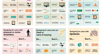
Curated Home Office accessibility posters
0
5 minutes

Editor’s note: Here are some very useful posters on designing for accessibilty from the UK government’s Home Office. A number of access requirements are covered here and the posters are a great example of how to share information in a simple, graphic way.

Curated
0

Editor’s note: Croatian designer Marko Dugonjić has created a site, using your computer’s webcam, that enables the on-screen text to change size according to where you are in relationship to the screen. Still in beta but worth keeping an eye on (excuse the pun).

Curated
0

Editor’s note: Editor’s note: No matter how well you design the mobile learning experience if you can’t access it, you can’t access it. We should be thinking about how we optimise content for devices, not designing standalone pieces of content.