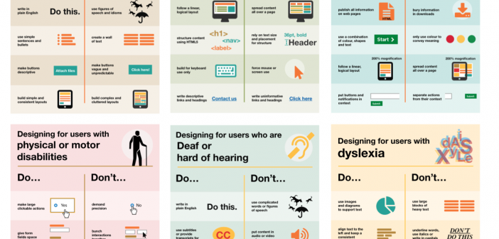
The dos and don’ts of designing for #accessibility are general guidelines, best design practices for making our services accessible. Currently, we have six different posters in our series that cater to users from these areas: low vision, deaf and hard of hearing, dyslexia, those with motor disabilities, users on the autistic spectrum and users of screen readers.
Curated from accessibility.blog.gov.uk
Some great tips here on making content more accessible from the UK government’s Home Office Digital team.


